The Need for Interactive Visualizations
Ever wondered if there is a way to make a report more interactive? Even though we really love BI & analytics tools, sometimes it is not possible to create the specific chart that you imagined, which can be frustrating. If you’ve got a need for charts that are not complex, your dataset is rather small and if BI tools fulfill all your current reporting needs, then it is a perfect option for you. However, if you are looking to scale and build dynamic, interactive, and actionable production data apps (like we do) and integrate them with enterprise data architectures (like we do with Databricks) then this article is worth reading until the end.
So, what are your options for building highly configurable, scalable, dynamic, live, and interactive data apps? What if we told you that, in addition to all said, it is also possible that AI automatically generates the visualizations that respond to your question?
Choosing the Right Solution
The initial option for us was to use Plotly’s Dash, which lets you develop low-code production data apps from scratch. If you have a data science team, we are sure they will love it as much as our data scientists. On Plotly’s website, you will find lots of useful resources, such as this one, so feel free to explore further.
An enhanced option for accelerating and easing development, deployment, and full operationalization would be to use Plotly’s Dash Enterprise, which provides incremental capabilities (and commercial support) to allow data scientists and Python developers to develop production data apps (better, faster, more easily) without reverting to a full-stack development team.
Accelerating data insights with Plotly
First things first, you need a good data processing engine, for sure combined with a dev/data science team as well. To get these interactive, complex, yet dynamic charts, you’ll need someone who can code. Then, the open-source options are endless. Combined with Python, Plotly Dash delivers interactive, customizable data apps that many industries are already using. Here’s how we utilize it as well for our clients.
Getting the data up and running
Usually, when Revenue.AI works with clients, to get the data up and running, there are multiple options. If the raw datasets are relatively small, we could get a CSV file with their data, that is uploaded to the portal. Another option is connecting to the client’s data lake through their Databricks. In this case, access to the client’s Databricks is needed, of course. Another option is using Revenue.AI’s own Databricks.
So, we could conclude that how we get the data up and running is very client specific. We just wanted to share a few possibilities of how it can be done. Our data engineering team does this part very efficiently and jumpstarts the project.
Then what happens is that the data starts getting processed. How? Through leveraging Spark as the distributed engine that can process and manipulate the data in parallel ways. What is important to note is that it is horizontally scalable. As if we are dealing with large datasets, scalability would be an important factor to consider.
If you are not a technical person, and you are reading this, then this might help as a good read. In summary, PySpark is the Python API for Apache Spark. It enables you to perform real-time, large-scale data processing in a distributed environment using Python. It also provides a PySpark shell for interactively analyzing your data.
You can imagine it like this: people standing in a line, that is not a well-organized queue at the start, but then they get aligned automatically, in a very neat queue. The same thing happens with data, it gets organized in a way that can be used for complex calculations.

Then the data can travel into the portal. And now it is ready to travel through time. Just kidding! Even if this process might sound complicated to non-technical people, it is not anything supernatural at its core. Said simply, it just gets processed, and then it is ready to be used and consumed by users.
If you are a technical person, then this might be a more interesting overview for you, and we will provide more details in the upcoming series of articles:
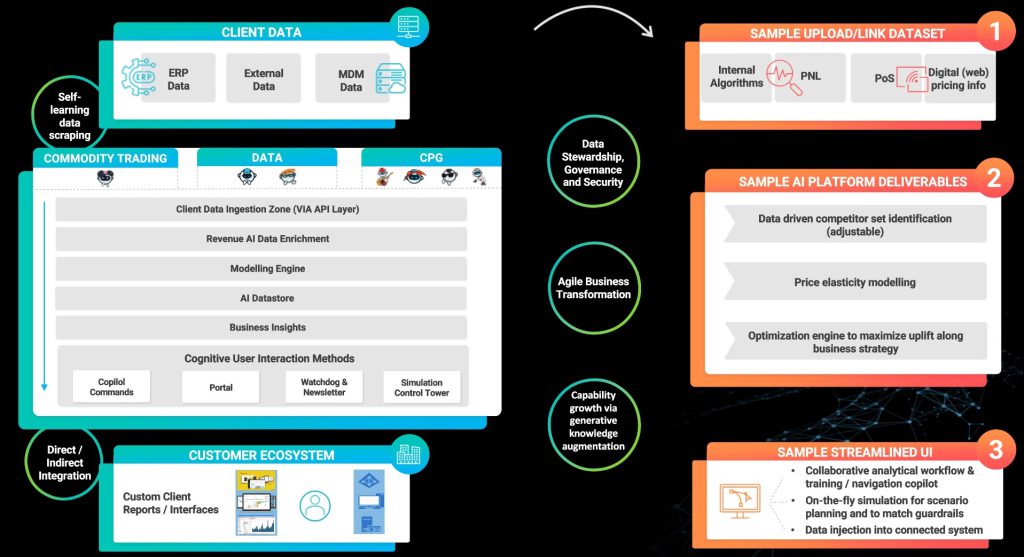
In a quick summary, various data sources get injected into the platform, and the output is shown in the customer ecosystem, where the interactive data apps built with Plotly also come to life.
So, who looks at these front ends usually? In our case, users usually have various roles such as Revenue Manager, RGM Analyst, and various commercial roles. Then it could also be Head of Market Risk, Traders, or roles more related to commodity trading. This also makes sense when you think about our industry solutions focus, as we provide solutions for CPG (FMCG) as well as for commodity trading industries. We’ll showcase how it all looks in a few moments.
Plotly’s Front-End Rescue for CPG
As a starting point, what we want to emphasize is that when you have a visualization, in another tool, that is not Plotly, it is usually a static image of a KPI, or whatever the chart represents. Looks something like this:
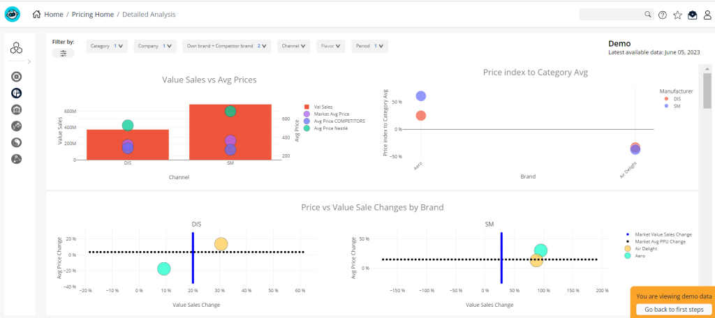
Here we showed a Volume Sales Simulation, which is a part of our Precision Pricing module for the CPG industry. But this is just a screenshot of the chart in our platform, which is how it would probably look in most tools, like Excel or a BI tool. With a lot of effort, you could make this interactive. But check out how cool it looks in Plotly:
Essentially, you can have multiple charts built into one chart, and since it is flexible, you can see the months or a yearly view, without the need of having multiple charts for reviewing KPIs monthly, daily, etc., or going through many more filters. And you can filter it chart by chart, which is also neat, as sometimes you don’t want all the charts to go through the filter.
This interactivity enhances the way you see the data, as well as the amount of information you are consuming, without taking any extra space for creating multiple charts, or the need of scrolling or switching from one page to another. It also looks way more organized this way; don’t you agree? Even with multiple charts, the data is not overwhelming.
What is also neat is that this is how the charts look based on the input data, but yours might look different based on the details of your business. It could even work for the service industry.
Plotly’s Front-End Rescue for Commodity Trading
Let’s also go ahead and see some of the charts we built with Plotly for the Commodity Trading industry solution. So, here’s an example of Technical Analysis, which is a part of the Commodity Trading pricing solution.
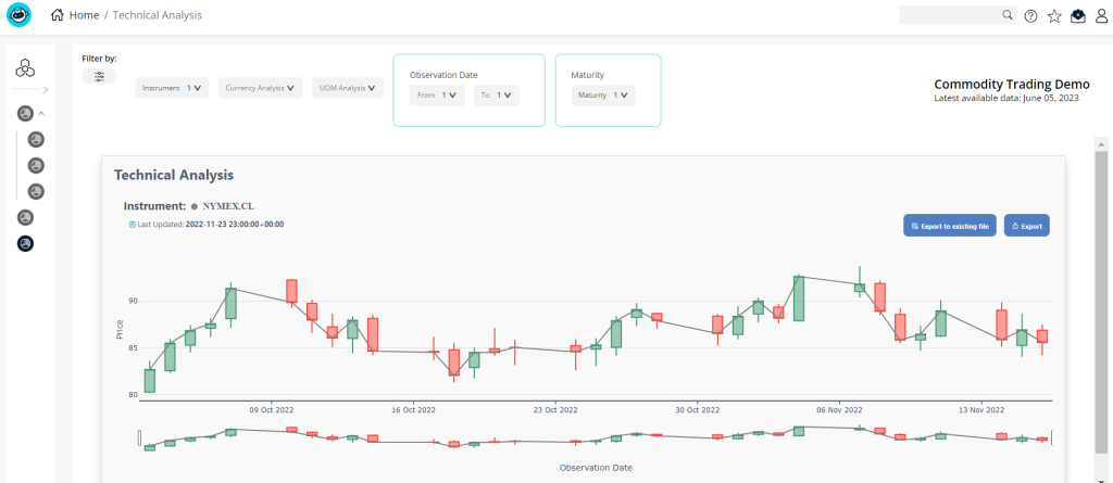
Now, as also showcased before, we first showed a static image. Now let’s bring this to life, and show how Plotly enhances data consumption:
Much more user-friendly than the static image, right? The best part is that all of these elements can get customized.
AI-powered Customization Possibilities
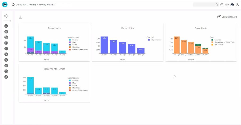
Chart Your Data, Your Way: Introducing the AI-Powered Dashboard Studio
Now we’d like to take the interactivity to a whole new level. One of the possibilities inside our platform is the option of the dashboard studio. A fully self-service engine, where you can build the dashboards/charts you would like to see, on your own. Plotly is again the one in charge of the front end. What is interesting in this case, is that the code is automatically generated by AI as well and can be configured inside the dashboard studio, as shown below: